CMHC Homeowner Insurance Connect (web & mobile)
I led the UX/UI design for CMHC Homeowner Insurance Connect, a responsive enterprise platform supporting mortgage-insurance workflows across multiple user roles.

Project: CMHC Homeowner Insurance Connect
Client: Canada Mortgage and Housing Corporation (CMHC)
Year: 2025
Role: Lead Product Designer, Product Vision & UX Strategy
My focus was on simplifying complex tasks, creating consistent navigation and component patterns, and defining clear responsive and implementation specifications so the experience remained usable, scalable and consistent from design through development.
Public Project Reference: CMHC’s 2025–2029 Corporate Plan outlines the broader modernization initiative this work supported
Visual Direction & Storytelling
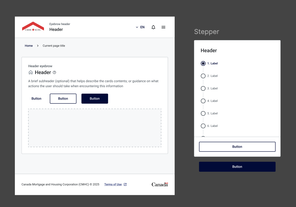
I helped shape the visual direction for the experience, selecting imagery and defining how photography, typography and messaging work together to communicate CMHC’s role in the Canadian housing ecosystem. The goal was to make the content feel more human, credible and emotionally connected to the people the organization serves.
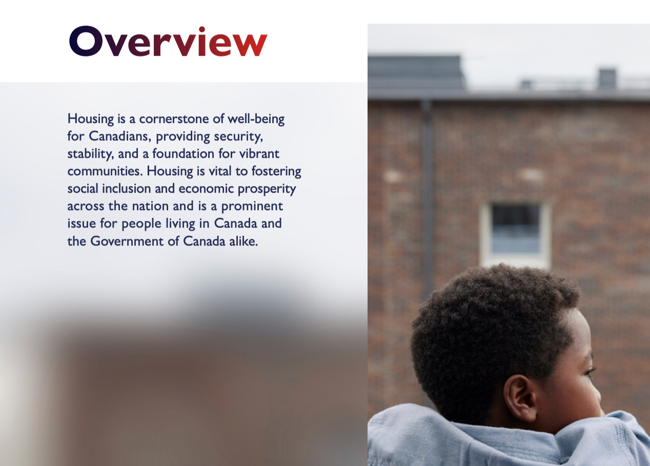
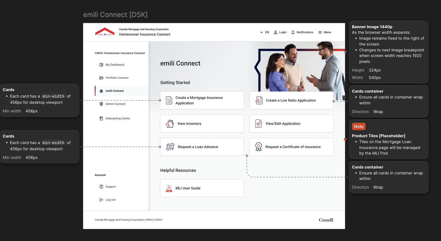
Homeowner Connect Dashboard - Emili Connect Tab
Designed the main workspace so users can quickly understand available tasks, actions and next steps without feeling overwhelmed
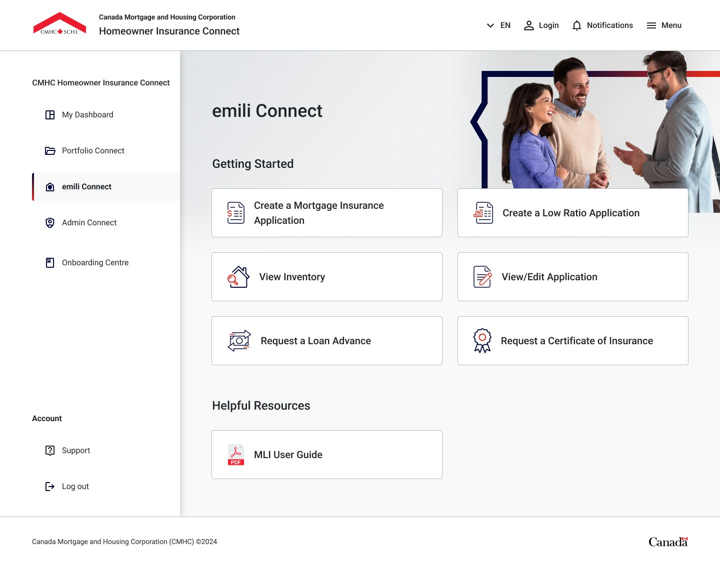
Admin Connect Dashboard
Structured the admin experience around more complex operational tasks and management functions while maintaining consistency with the broader design system.
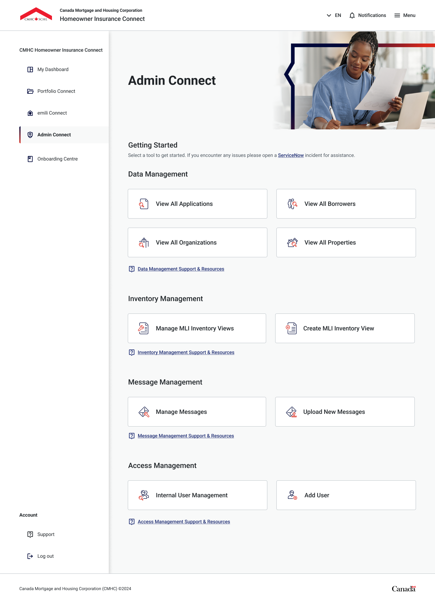
Annotations & Developer Specifications
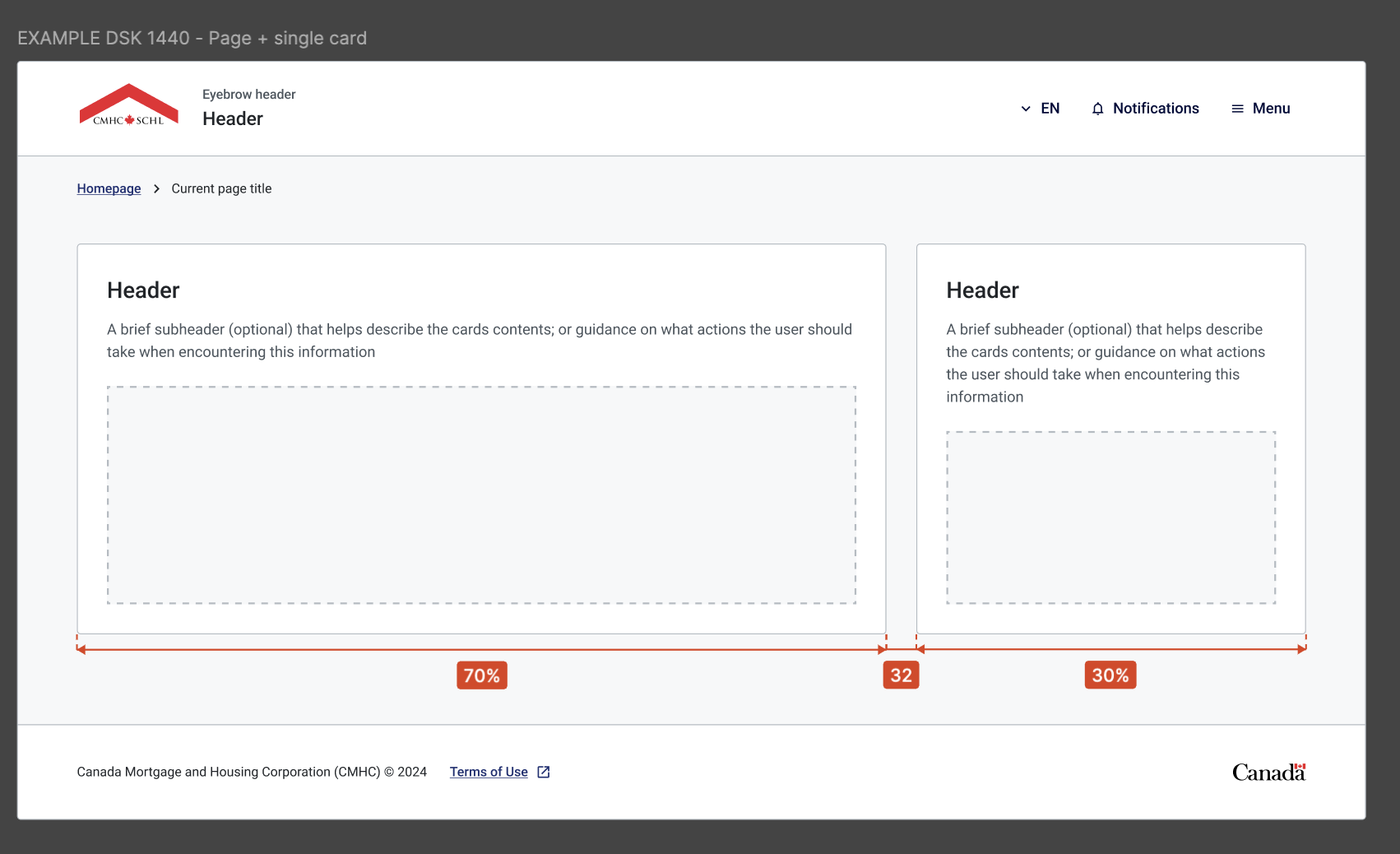
I create detailed, implementation-ready annotations so developers clearly understand intended behaviours, layout rules, states and edge cases. I work collaboratively throughout delivery, but I make the design logic explicit so there is minimal ambiguity between design intent and the final build.
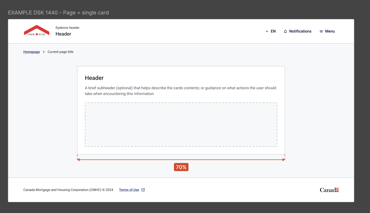
70% layout: 1008 px at 1440 px desktop width
I use a narrower 70% content container when the experience benefits from stronger focus, readability and a more controlled visual hierarchy.
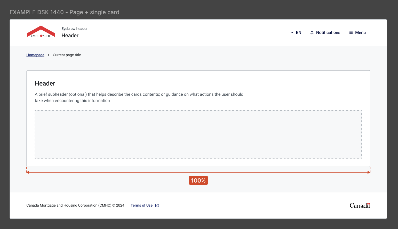
100% layout: 1440 px at 1440 px desktop width
I use the full available content width when the layout needs more space for dense information, larger components or broader workflows.
Responsive Mobile Layout Specifications
I define how layouts and components adapt from desktop to mobile, including stacking behaviour, spacing, content hierarchy and responsive breakpoints. This gives developers clear guidance on how the experience should scale while preserving usability and design consistency.
Design System & Progressive Information Hierarchy
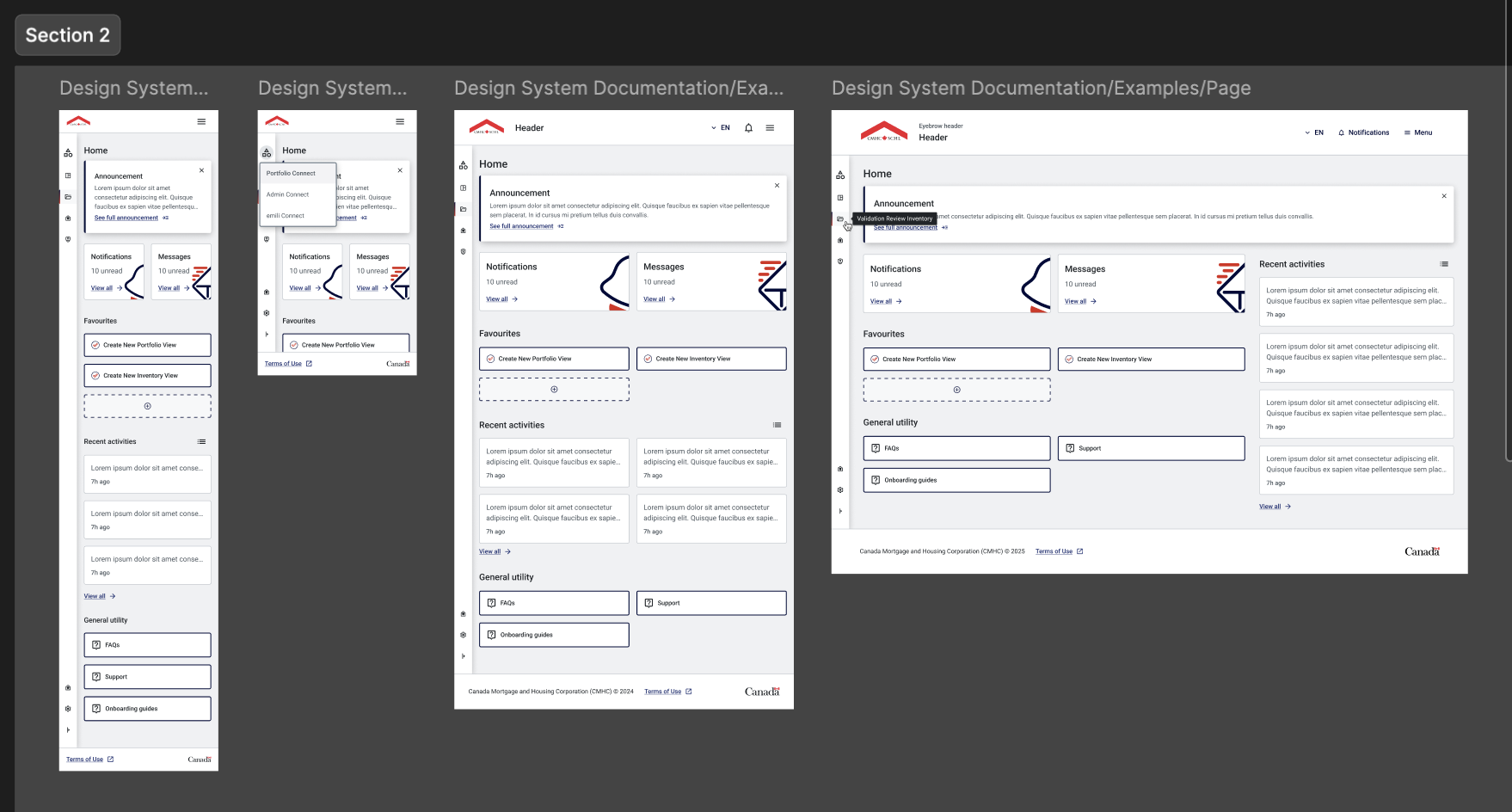
I used the design system to keep components, spacing and interaction patterns consistent, while progressively reorganizing and revealing information as screen space increases. This keeps priority actions clear on smaller screens and allows richer dashboard content to surface on larger layouts without losing structure or usability.
As screen space increases, I progressively reveal and reorganize secondary information rather than simply scaling the same layout. This keeps the most important actions prominent on smaller screens while allowing richer dashboard content and activity context to appear on larger ones.
Resolving Breadcrumb Inconsistencies
I identified inconsistencies in breadcrumb patterns across the project and standardized the hierarchy, labels and interaction behaviour. This improved navigation clarity, reduced cognitive friction and created a more consistent experience across the product.
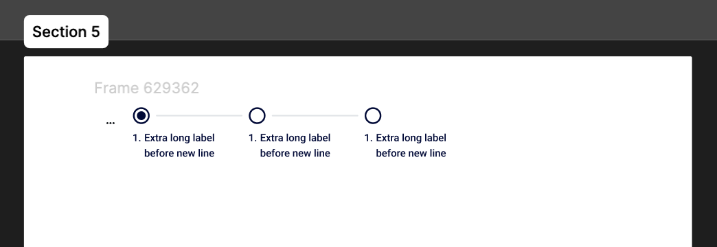
Responsive Components & Stepper Behaviour
I design responsive patterns with the full user journey in mind, not just individual screens. I define how components such as steppers, buttons and navigation should behave across desktop and mobile, so the experience stays clear, consistent and easy to use. My approach is collaborative, but I make the interaction logic and responsive behaviour explicit so developers can build with confidence and the final experience stays true to the design intent.