

DESIGN CONSULTING
This project was at PWC for the client Government of British Columbia, Canada - highly impactful project with an emphasis on legal and litigation work. It will directly impact daily lives of Canadian Citizens with following scenarios: filing a small claims complaint, reporting a car accident and a dispute against a strata corporation.


ABOUT THIS PROJECT
🌟 Project: Enhancing an existing app, redesigning tribunal process and simplifying it dramatically. Also digitizing certain manual processes. A truly unique project that will impact Canadian citizens’s interaction with the Civil Resolution Tribunal (CRT) in BC, Canada.
👩🏻🔧 My Role: UX/UI Lead Designer, working specifically on the Online Tribunal Application form and its form design.
👥 Stakeholders: Civil Resolution Tribunal Business leaders, another UX Designer, Product Owner, Developer, Behavioural Insights Team, a psychologist, Accessibility expert, legal experts.
🏋🏻♀️ Challenges: Technical challenges of using Salesforce components, complexity of the legal system, understanding legal process and then simplifying a complex legal process, legal terminology and short project timelines.
🧠 Opportunities: Designing for accessibility & inclusivity — making the website WCAG AA Standard compliant, conducting research with users regarding (vision impairment, mental issues, hearing issues, learning disabilities).
💪 Impact: Digitizing legal process during COVID for Canadian Citizens.
✂️ Tools: Figma (for collaboration), Mural (design workshops), Google Slides, accessibility checker.
KEY DELIVERABLES
This project was entirely remote from day 1 to day 60 and had very defined deliverables.
Design Workshops: Remote & collaborative online workshops with client.
Presentations: Created 100 pages + presentations for the client to see step by step progress.
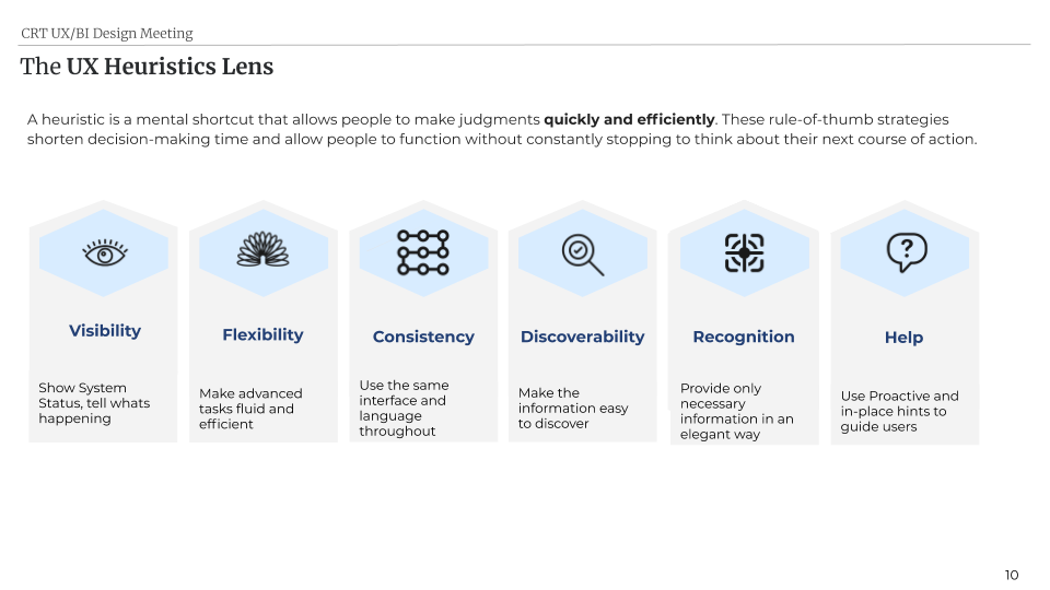
UX Recommendations: 50 + recommendations using Heuristic Principles.
Wireframes & Prototype: Design the big picture experience of the app.
User Testing: 1 week assigned to conduct user testing (one-one interview sessions).
🚨Spoiler Alert (we received great feedback) 🚨
PROJECT TIMELINE & SCOPE
I helped the team lay out a systematic roadmap to stay on track, deliver on time (ahead of development) and manage risk.

DESIGN WORKSHOPS
To understand the existing legal process of the tribunal, different channels of communication, how documents are collected, who are key decision makers, and digging for where the gaps and pain points lie/ finding areas of improvement.


PRESENTATIONS: 100 + pages
Design is all about sharing, communicating and presenting thoughts and ideas. “As designers, we possess the knowledge and experience to understand the user’s needs while also having the craftsmanship and expertise to interpret these needs into practical and aesthetically engaging solutions. To demonstrate our understanding, we must be able to articulate a considered design approach without reservation.” By learning legal concepts and legal language, I could communicate my design thoughts with with members of the tribunal and won them over.
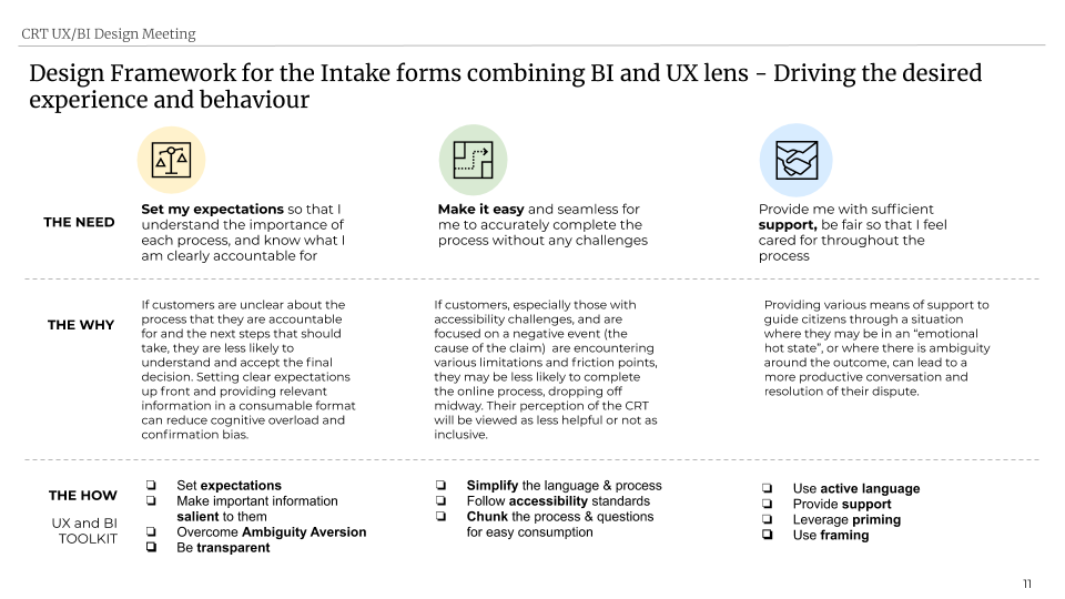
PRIORITY BASED RECOMMENDATIONS
Timelines were tight and goals had to be met, so I helped the team by listing out UX Recommendations in H, M,L priority levels. This way the business knew where to focus our energy and also has visibility on the risk involved.

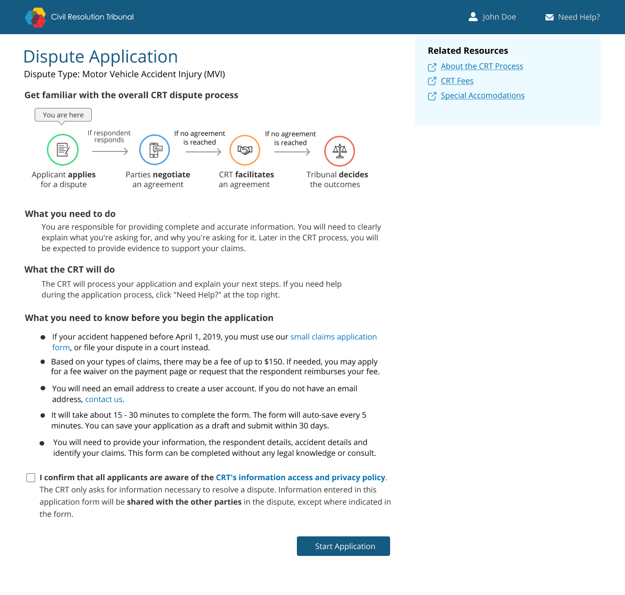
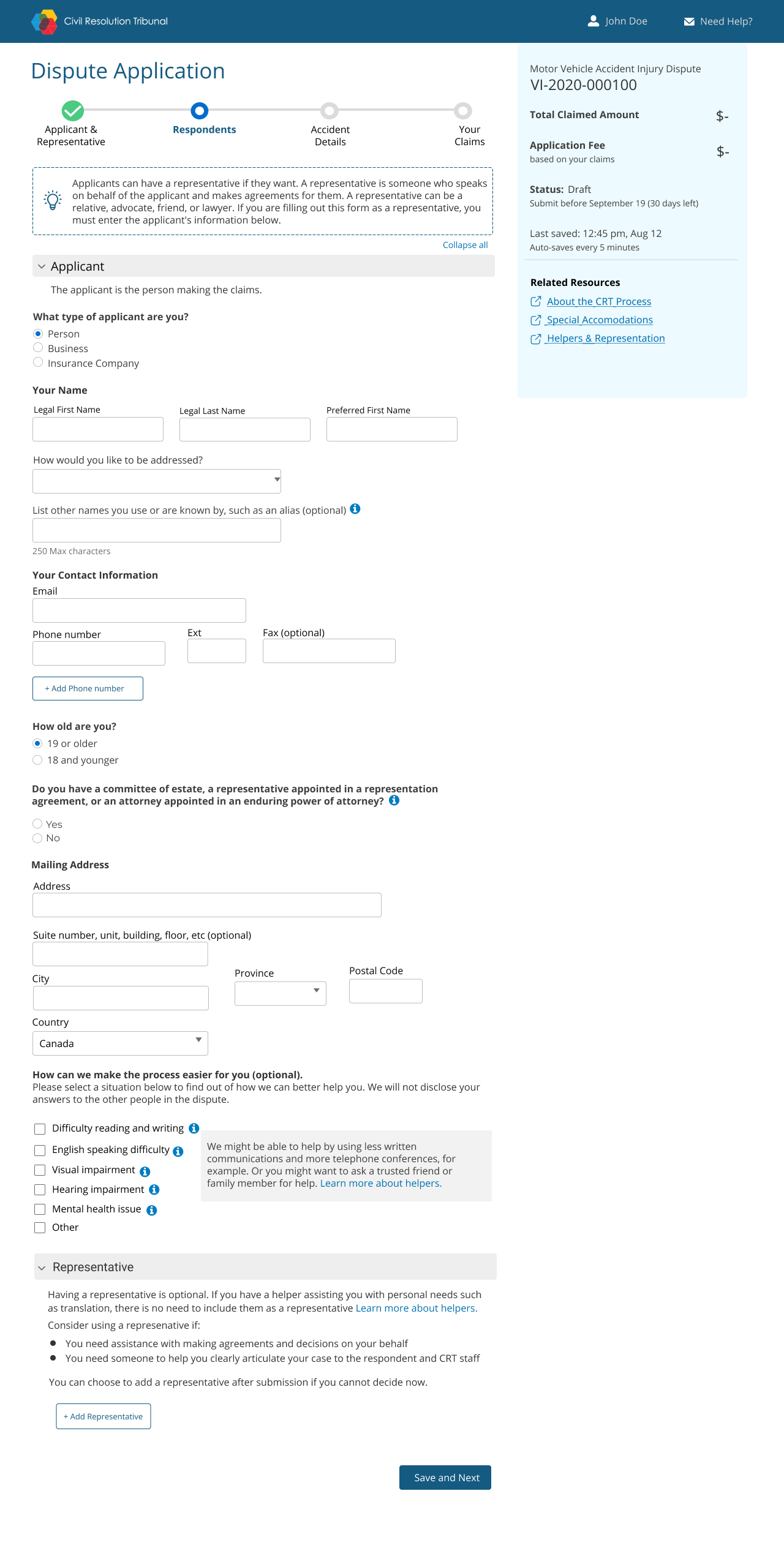
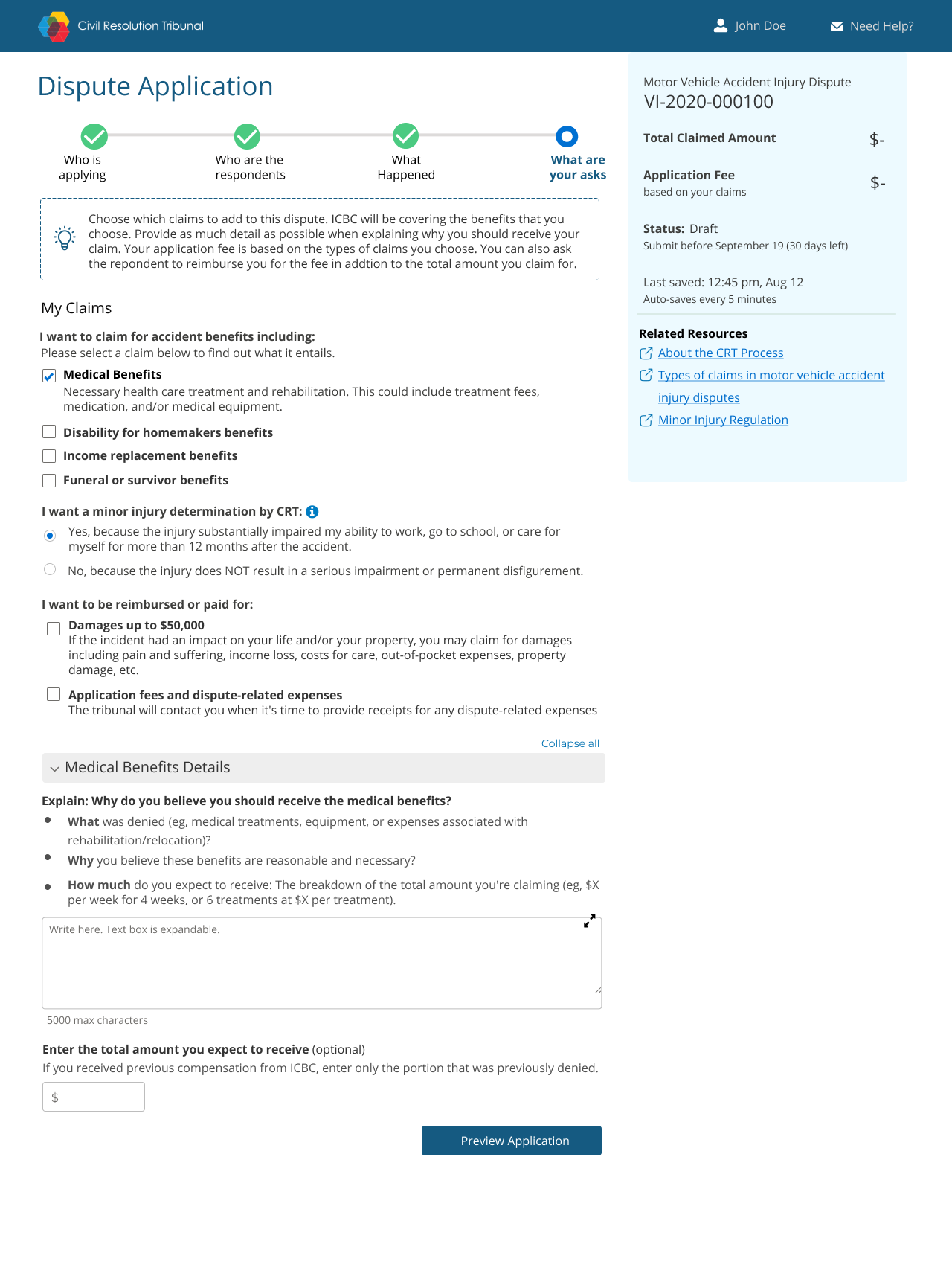
WIREFRAMES (MID-FIDELITY)
I believe that a wireframe speaks a 1000 words. It was important for the team to respond to a visual soon to see if we are talking about the same thing and we are imaging the same picture. I quickly whipped up some wireframes to show the team (in a weeks time). Due to Confidentiality, I cannot display all the wireframes.

USER TESTING SESSIONS

USER TESTING SCRIPT
🔥 USER TESTING RESULTS 🔥
After conducting usability sessions (1 week), I consolidated the findings and looked at the similarities across participants. Overall, we received positive sentiments and users preferred the new improved design and with a 4 out 5 score.
But there was room for improvement, so I further identified areas we can improve on.
Legal Terminology: A common pain point mentioned by majority participant was “I can’t understand the legal terminology” so I further simplified the language.
Scannable: Users did not read all the information, and were rather scanning the page, so I reduced text on the page and made it logic/conditional based.
Accessibility: Some parts of the app were not visually accessible so I improved the colour contrast ratios and fonts and also notified the development team to make the code accessibility friendly.
Bias: Participants seemed to have pre-constructed negative sentiments towards such systems. “Don’t like the word supportive as most systems like this are not supportive based on my previous experiences.” So I realized I would need to put extra effort in making them feel supported by using friendly visual elements & language.
HIGH FIDELITY WIREFRAMES
Based on feedback from user testing, I revisited the wireframes again and further edited and improved our design. Due to Confidentiality, I cannot display all the wireframes.

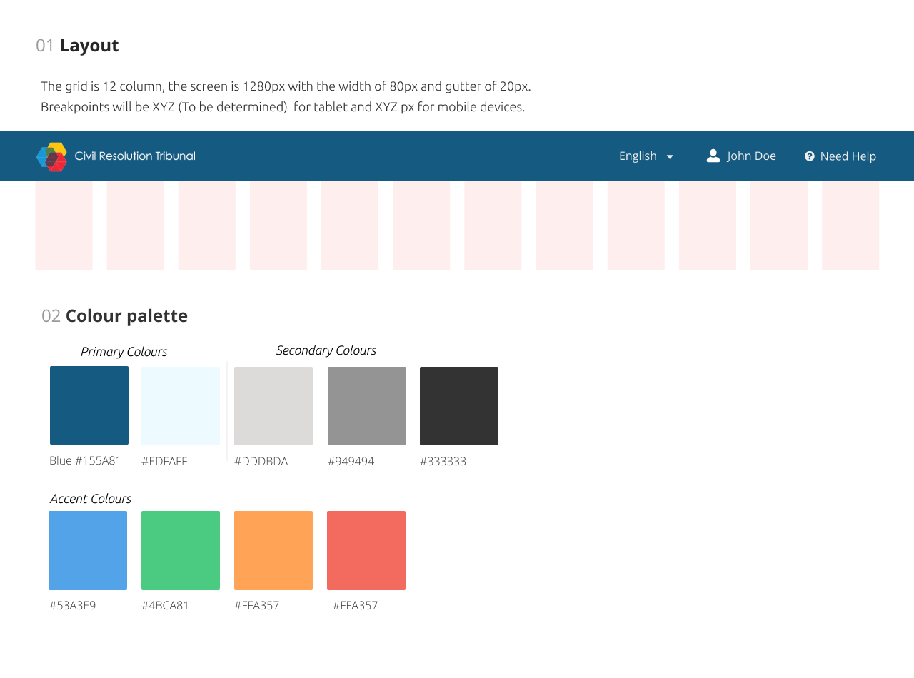
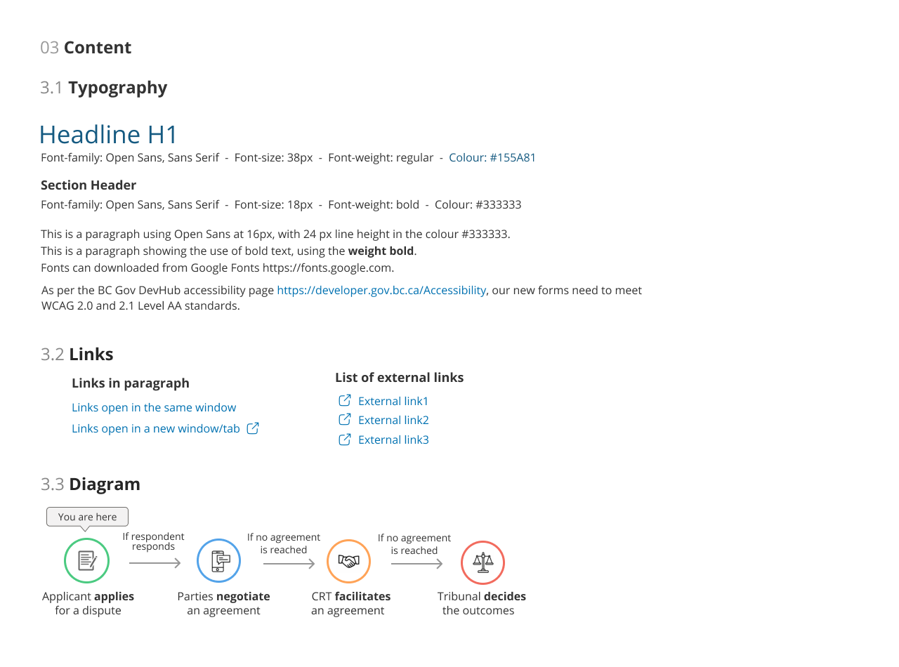
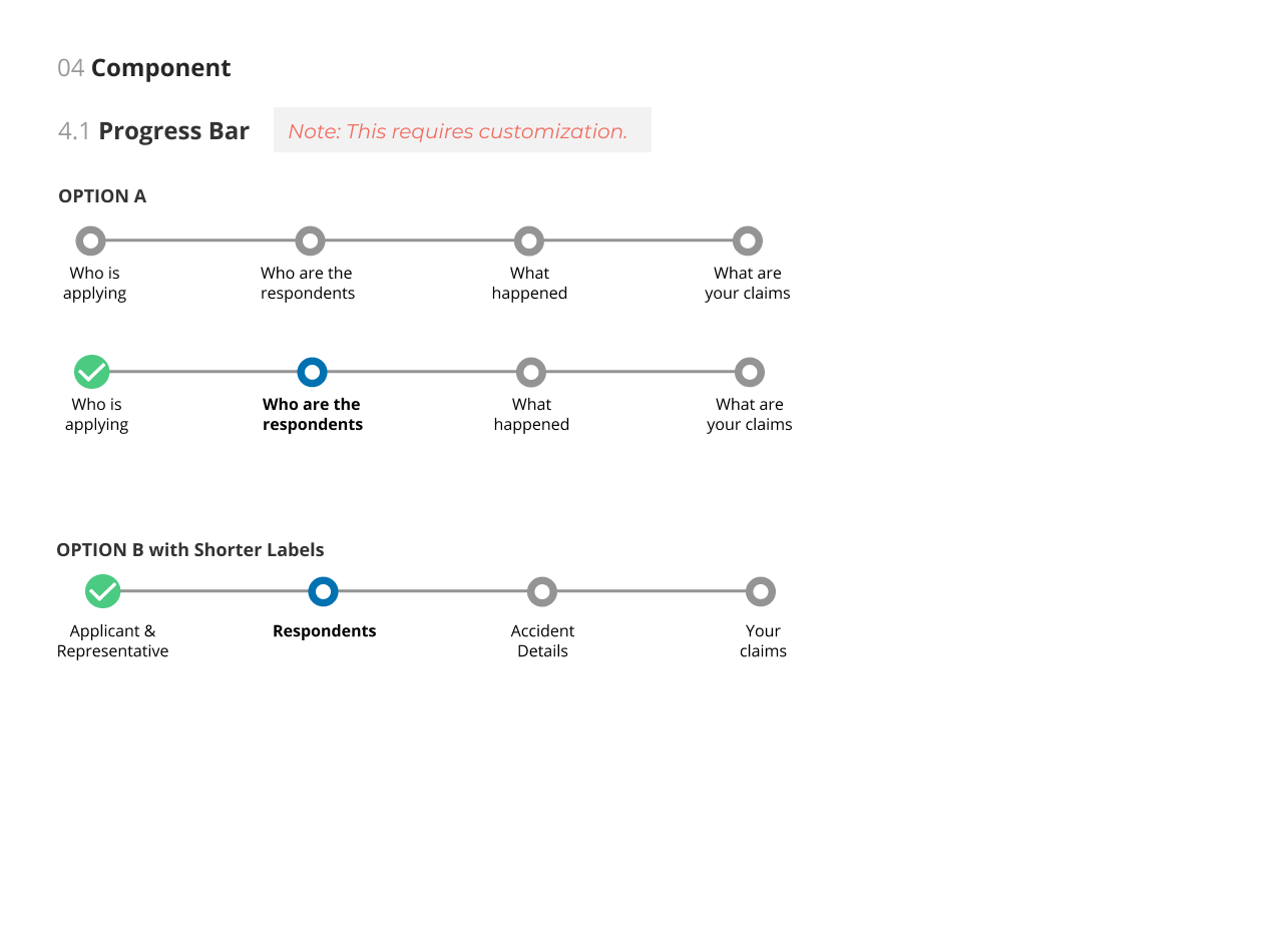
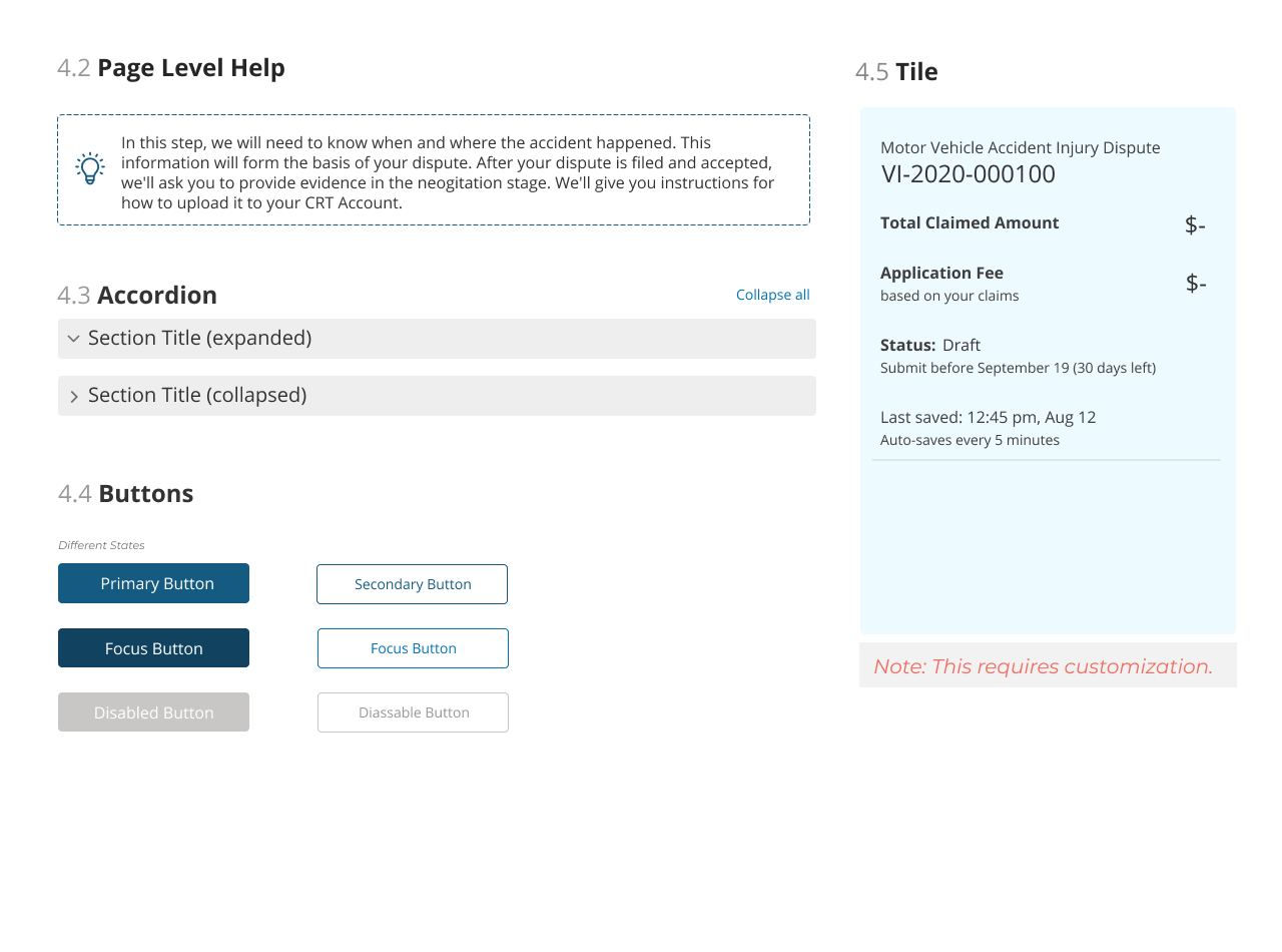
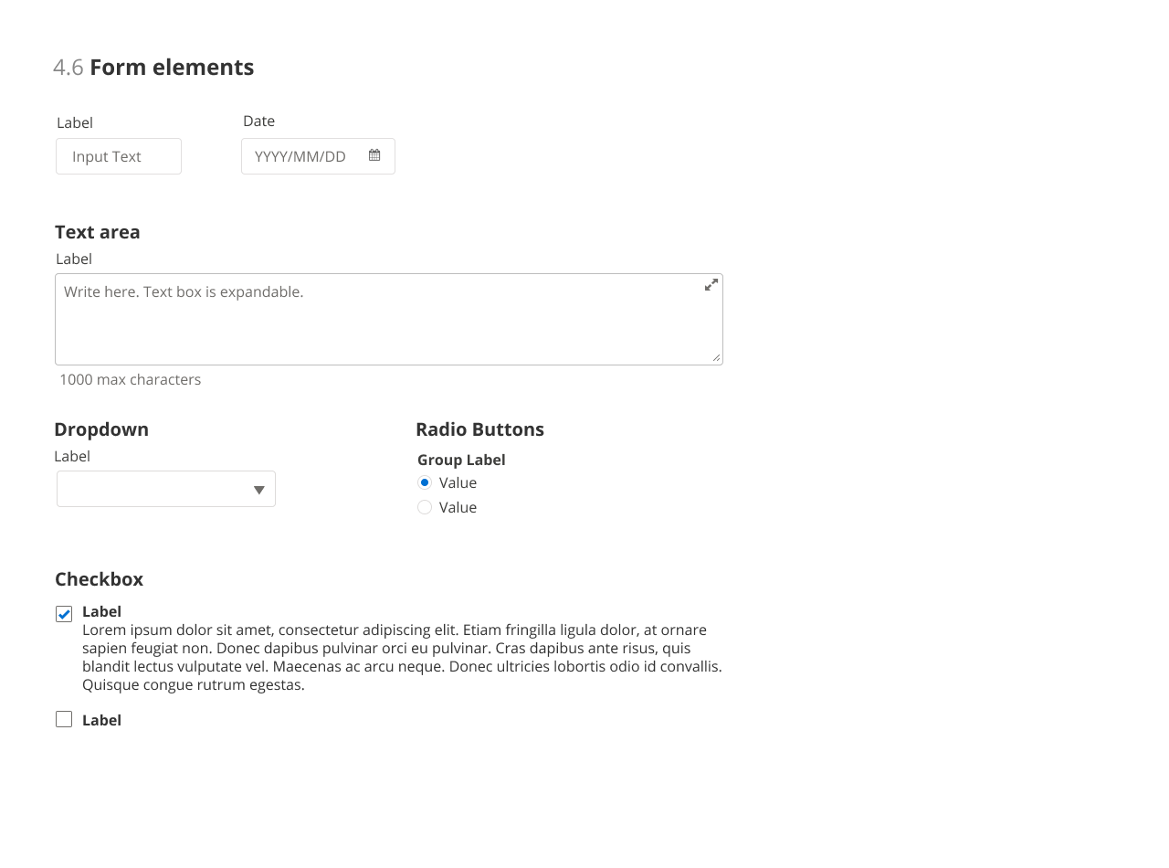
STYLE GUIDE
⬆️ Back to top Next Project ➡️
Have a project in mind?
I specialize in designing thoughtful, scalable user experiences — from concept to execution.