‘MYROGERS’ MOBILE APP
Redesigned and enhanced functionality for an existing mobile app - natively for both Android and iOS versions.


ABOUT THIS PROJECT
🌟 My role: UX/UI Design Lead, 8 month project that focused on ‘MyRogers’ Mobile app (native Android & iOS) used by 1 million users in Canada. Managed design consistency on both devices, referred the Android & iOS guidelines.
👥 Worked with stakeholders: Product Owner, Visual Designer (junior), Accessibility specialist, Business leads, Data Analytics team, Lead Developers (iOS & Android), Quality Assurance and Marketing team.
🧠 Technical: React UI components, Worked with technical team to discuss the Level of effort required.
✂️ Tools: Sketch, AxureRP, Photoshop, Zeplin, Invision.
HOW WAS SUCCESS MEASURED?
By setting clear goals.
Goal #1 MINIMAL LOGIN EFFORT: The new app will have both pre-authentication and post-authentication mode. This will be an upgrade from the existing state, as the existing Rogers app only focuses on post-login experience. Users can access most functions in device mode until they need to access credential required functions, eg. account level changes.
Goal #2: CLEAR VISUAL HIERARCHY: The new app will be mainly structured by lines, following new device mode concept, while the existing Rogers app and Rogers.com organize contents per accounts.
Goal #3: MULTI-ACCOUNT LOG-IN: After listening to customers during user testing sessions, we realized that customers are frustrated with signing in a out of apps if they have multiple accounts. Hence we came up with multi-login.
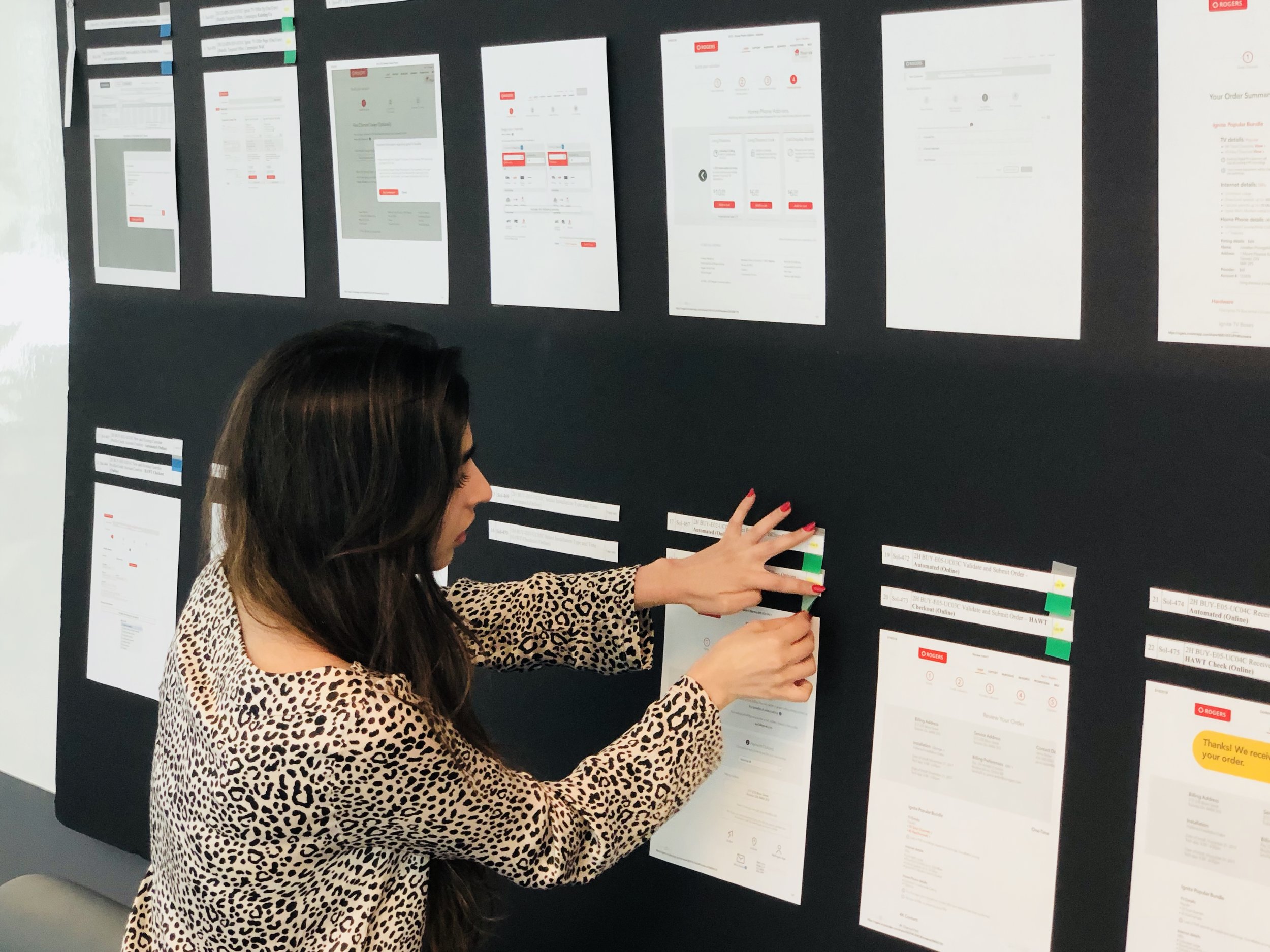
DESIGN WORKSHOPS & TEAM COLLABORATION
Prioritizing and visualizing the user flow diagram, discussing stories assigned to me with Product Owner in detail


INFORMATION ARCHITECTURE
Top level view of the structure and flow of the mobile app - This involved arranging information in a way that is easy to find, easy to navigate through and scalable as the app grows (once we add new features to it).

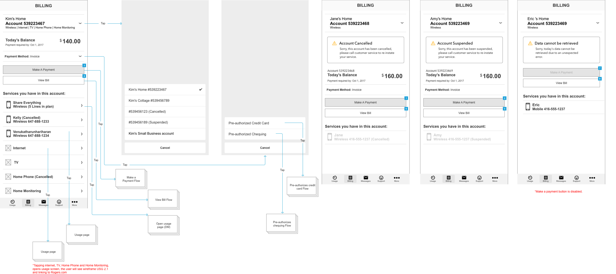
USER FLOW & CONDITIONAL LOGIC
Quick and dirty low-fidelity wireframes created on Axure RP to visualize the user flow when used on a mobile device.

LOW FIDELITY WIREFRAMES
Billing was an important reason why a user would come to this app. Hence we spent quite some time sketching out and discussing billing tab scenarios. Questions I asked users while designing “How easy it to find the bill page, when you land here and are thinking of making a payment, is there any hesitation in your mind? If so, what are thoughts that occur to you? Do you usually check if the billing details are accurate and go back into the data usage section?”
STYLE GUIDE
Logo, typography, colours, buttons, input fields, padding. Also used Zeplin (a tool to handoff designs and style elements with accurate specs, assets, code snippets automatically to developers.


Deliberately shown only low resolution images as it is company work.
HIGH FIDELITY WIREFRAMES
High fidelity wireframes specifically for on-boarding a user for the first time (I am limited to displaying only these due to confidentiality).


Thanks for being so curious! :)
I've added more design work from Scotiabank, Deloitte and TD...
⬆️ Back to top Next Project ➡️
Have a project in mind?
I specialize in designing thoughtful, scalable user experiences — from concept to execution.